Sunday, August 31, 2014
Rose Bubbles
Here's another flower taking a dunk in sparkling water. This time a rose is the lucky victim. While the background is a simple gradient, the graduations of gray makes the red rose really pop. I think this one and the wildflower I posted a few days ago are my favorites. I plan to do many more using other objects in addition to florals.
Saturday, August 30, 2014
Reedy Sunset
The reeds are vectors that I used for another project involving a couple mice. Adding the reed silhouettes to this sunset I shot a few years ago make for an interesting composition. I know the sunset colors are a bit extreme, but that's okay. Once I've committed to manipulating a photo, not even the sky is a limit.
Friday, August 29, 2014
100 Poison Frogs
A couple years ago, I did "Frog Week" here on my blog. It was a takeoff of Shark Week, but with less teeth.
One of the posts that week featured 100 poison frog sketches. The plan was to make digital artwork of 100 Poison Frogs. I did four of them and then moved onto something else. The frog sketches sat in a folder until I got the idea to create a big frog out of all those little sketches. This is the final result.
One of the posts that week featured 100 poison frog sketches. The plan was to make digital artwork of 100 Poison Frogs. I did four of them and then moved onto something else. The frog sketches sat in a folder until I got the idea to create a big frog out of all those little sketches. This is the final result.
Thursday, August 28, 2014
Grizzly Style
While going through some of my older digital photos, I ran across this grizzly I shot at Cabelas in Baltimore, MD. The pose and position of the bear is really good, but the photo quality was not real good. So I used one of my old sunsets and played around with a couple Topaz filters. This turned out better than I thought it would, so now I want to try it again. Next time putting a little more effort in cleaning around the edges. See the bottom of the right paw? Sloppy.
Tuesday, August 26, 2014
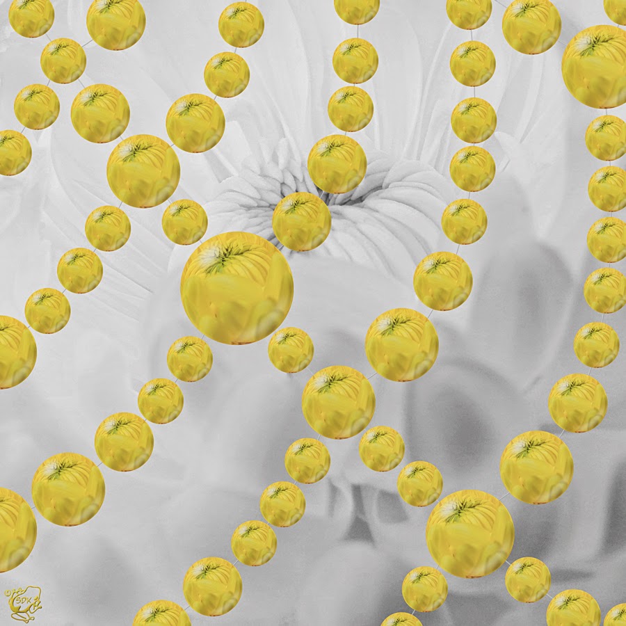
Mums the Word...again
 The original photo of the mums was a macro photo in color. Before adjusting it to black and white, a color orb was made in Photoshop. I have highlight areas, made as a vector in Inkscape, that I add to the orbs to add a bit of realism. The Web is also vectors and the orbs are copied, resized, and placed on the Web lines.
I don't really know if I like this or not. I've done a dozen or so of these web drops. Some I like and some are just, eh, okay. A couple were actually horrible. This one is okay, I guess. It looked awesome in my mind, but you never know for sure until you're finished with it and sizing it up.
Monday, August 25, 2014
Tiny Bubbles
Do you remember the old song "Tiny Bubbles" by Dean Martin? That's what goes through my mind when I do these bubble photos.
The flower or object is weighted down in a glass filled with seltzer water. It helps to have a square styled glass and straw or artists paint brush to keep the bubbles off the inside of the glass. I used a lead fishing sinker to keep this little wildflower from floating away. Bubbles formed and reformed on the flower. I took around 25-30 shots and this was the one I liked the best.
The flower or object is weighted down in a glass filled with seltzer water. It helps to have a square styled glass and straw or artists paint brush to keep the bubbles off the inside of the glass. I used a lead fishing sinker to keep this little wildflower from floating away. Bubbles formed and reformed on the flower. I took around 25-30 shots and this was the one I liked the best.
Friday, August 22, 2014
Steampunk Hatchetfish II
I recently got a nice camera with a full sized sensor. One of the first things I wanted to do was retake photos of some of my polymer clay pieces. When I reshot this Steampunk Hatchetfish, it was taken in HDR.
While this version of my hatchetfish is okay, there is still room for improvement with the background. Don't be surprised to see a third version of this one in the not-to-distant future.
While this version of my hatchetfish is okay, there is still room for improvement with the background. Don't be surprised to see a third version of this one in the not-to-distant future.
Subscribe to:
Comments (Atom)


